decision plot
目录
1 SHAP 决策图
1.1 加载数据集并训练模型
1.2 计算 SHAP 值
2 基本决策图功能
3 何时决策图有帮助?
3.1 清晰地显示大量特征效果
3.2 可视化多输出预测
3.3 显示交互作用的累积效应
3.4 探索一系列特征值的特征效果
3.5 识别异常值
3.6 识别典型的预测路径
3.7 比较和对比几个模型的预测
4 SHAP 交互值
5 在图之间保持顺序和比例
6 选择要显示的特征
7 更改 SHAP 基值
SHAP 决策图
SHAP 决策图显示复杂模型如何得出其预测(即,模型如何做出决策)。本笔记本通过简单示例说明了决策图功能和用例。有关更具描述性的叙述,请点击此处。
加载数据集并训练模型
对于大多数示例,我们采用在 UCI Adult Income 数据集上训练的 LightGBM 模型。目标:预测个人年收入是否超过 5 万美元。
[1]:
import pickle
import warnings
from pprint import pprint

import lightgbm as lgb
import matplotlib.pyplot as plt
import numpy as np
from sklearn.model_selection import StratifiedKFold, train_test_split

import shap

X, y = shap.datasets.adult()
X_display, y_display = shap.datasets.adult(display=True)

# create a train/test split
random_state = 7
X_train, X_test, y_train, y_test = train_test_split(X, y, test_size=0.2, random_state=random_state)
d_train = lgb.Dataset(X_train, label=y_train)
d_test = lgb.Dataset(X_test, label=y_test)

params = {
    "max_bin": 512,
    "learning_rate": 0.05,
    "boosting_type": "gbdt",
    "objective": "binary",
    "metric": "binary_logloss",
    "num_leaves": 10,
    "verbose": -1,
    "min_data": 100,
    "boost_from_average": True,
    "random_state": random_state,
}

model = lgb.train(
    params,
    d_train,
    10000,
    valid_sets=[d_test],
    early_stopping_rounds=50,
    verbose_eval=1000,
)
Training until validation scores don't improve for 50 rounds.
Early stopping, best iteration is:
[683]   valid_0's binary_logloss: 0.277144
计算 SHAP 值
计算前 20 个测试观察的 SHAP 值和 SHAP 交互值。
[2]:
explainer = shap.TreeExplainer(model)
expected_value = explainer.expected_value
if isinstance(expected_value, list):
    expected_value = expected_value[1]
print(f"Explainer expected value: {expected_value}")

select = range(20)
features = X_test.iloc[select]
features_display = X_display.loc[features.index]

with warnings.catch_warnings():
    warnings.simplefilter("ignore")
    shap_values = explainer.shap_values(features)[1]
    shap_interaction_values = explainer.shap_interaction_values(features)
if isinstance(shap_interaction_values, list):
    shap_interaction_values = shap_interaction_values[1]
Explainer expected value: -2.4296968952292404
基本决策图功能
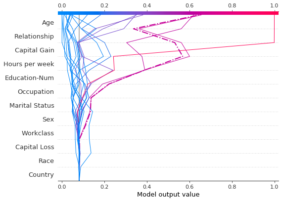
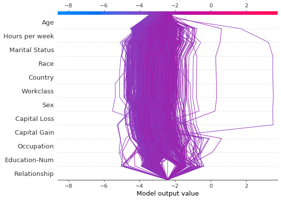
请参阅下面 20 个测试观察的决策图。注意:此图本身没有信息量;我们仅使用它来说明主要概念。 * x 轴表示模型的输出。在本例中,单位是对数几率。 * 该图在 x 轴上以 explainer.expected_value 为中心。所有 SHAP 值都相对于模型的期望值,就像线性模型的效果相对于截距一样。 * y 轴列出了模型的特征。默认情况下,特征按降序重要性排序。重要性是针对绘制的观察结果计算的。这通常与整个数据集的重要性排序不同。 除了特征重要性排序之外,决策图还支持分层聚类特征排序和用户定义的特征排序。 * 每个观察的预测都用彩色线表示。在图的顶部,每条线在其对应的观察预测值处击中 x 轴。此值确定光谱上线的颜色。 * 从图的底部到顶部移动,每个特征的 SHAP 值都添加到模型的基本值中。这显示了每个特征如何贡献于整体预测。 * 在图的底部,观察结果在 explainer.expected_value 处收敛。
[3]:
shap.decision_plot(expected_value, shap_values, features_display)

与力图类似,决策图支持 link='logit' 将对数几率转换为概率。
[4]:
shap.decision_plot(expected_value, shap_values, features_display, link="logit")

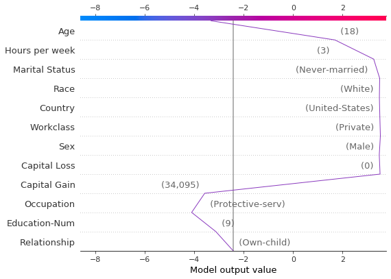
可以使用虚线样式突出显示观察结果。在这里,我们突出显示一个错误分类的观察结果。
[5]:
# Our naive cutoff point is zero log odds (probability 0.5).
y_pred = (shap_values.sum(1) + expected_value) > 0
misclassified = y_pred != y_test[select]
shap.decision_plot(expected_value, shap_values, features_display, link="logit", highlight=misclassified)
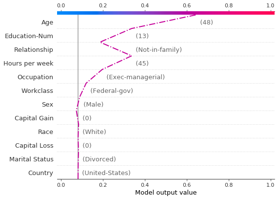
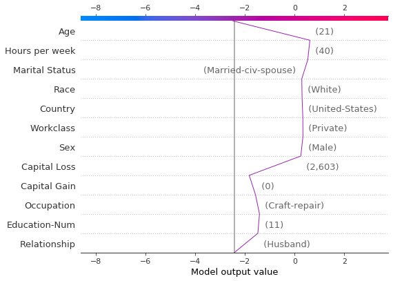
让我们通过单独绘制错误分类的观察结果来检查它。当绘制单个观察结果时,会显示其对应的特征值。请注意线的形状已更改。为什么?特征顺序已根据此单个观察结果的特征重要性在 y 轴上更改。“在图之间保持顺序和比例”部分介绍了如何为多个图使用相同的特征顺序。
[6]:
shap.decision_plot(
    expected_value,
    shap_values[misclassified],
    features_display[misclassified],
    link="logit",
    highlight=0,
)
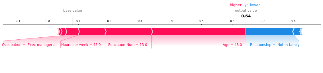
下面显示了错误分类观察结果的力图。在本例中,决策图和力图都可以有效地显示模型如何得出其决策。
[7]:
shap.force_plot(
    expected_value,
    shap_values[misclassified],
    features_display[misclassified],
    link="logit",
    matplotlib=True,
)
何时决策图有帮助?
决策图有几个用例。我们在此处介绍几个案例。 1. 清晰地显示大量特征效果。 2. 可视化多输出预测。 3. 显示交互作用的累积效应。 4. 探索一系列特征值的特征效果。 5. 识别异常值。 6. 识别典型的预测路径。 7. 比较和对比几个模型的预测。
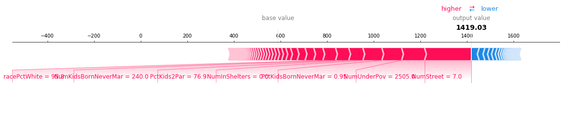
清晰地显示大量特征效果
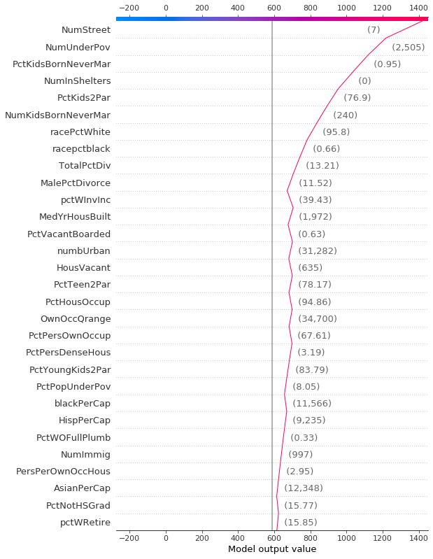
与力图类似,决策图显示了模型输出中涉及的重要特征。但是,当涉及大量重要特征时,决策图可能比力图更有帮助。为了演示,我们使用在 UCI Communities and Crime 数据集上训练的模型。该模型使用 101 个特征。下面的两个图描述了相同的预测。力图的水平格式使其无法清晰地显示所有重要特征。相比之下,决策图的垂直格式可以显示任意数量的特征效果。
[8]:
# Load the prediction from disk to keep the example short.
with open("./data/crime.pickle", "rb") as fl:
    a, b, c = pickle.load(fl)
shap.force_plot(a, b, c, matplotlib=True)
[9]:
shap.decision_plot(a, b, c, feature_display_range=slice(None, -31, -1))
可视化多输出预测
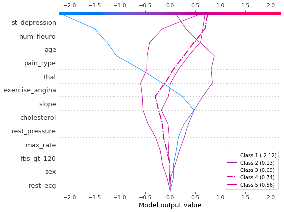
决策图可以显示多输出模型如何得出预测。在本例中,我们使用在 UCI Heart Disease 数据集上训练的 Catboost 模型的 SHAP 值。有五个类别指示疾病的程度:类别 1 表示没有疾病;类别 5 表示晚期疾病。
为了保持示例简短,SHAP 值从磁盘加载。变量 heart_base_values 是每个类别的 SHAP 期望值列表。同样,变量 heart_shap_values 是 SHAP 矩阵列表;每个类别一个矩阵。这是 shap.TreeExplainer 返回的多输出格式。
[10]:
# Load all from disk to keep the example short.
with open("./data/heart.pickle", "rb") as fl:
    (
        heart_feature_names,
        heart_base_values,
        heart_shap_values,
        heart_predictions,
    ) = pickle.load(fl)
class_count = len(heart_base_values)
创建一个函数,为图例生成标签。提示:在图例标签中包含预测值,以帮助区分类别。
[11]:
def class_labels(row_index):
    return [f"Class {i + 1} ({heart_predictions[row_index, i].round(2):.2f})" for i in range(class_count)]
使用 shap.multioutput_decision_plot 绘制观察 #2 的 SHAP 值。该图的默认基值是多输出基值的平均值。SHAP 值会相应调整以产生准确的预测。虚线(突出显示)线表示模型的预测类别。对于此观察,模型确信存在疾病,但无法轻易区分类别 3、4 和 5。
[12]:
row_index = 2
shap.multioutput_decision_plot(
    heart_base_values,
    heart_shap_values,
    row_index=row_index,
    feature_names=heart_feature_names,
    highlight=[np.argmax(heart_predictions[row_index])],
    legend_labels=class_labels(row_index),
    legend_location="lower right",
)
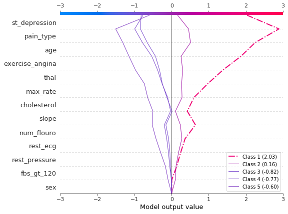
对于观察 #3,模型自信地预测不存在疾病。
[13]:
row_index = 3
shap.multioutput_decision_plot(
    heart_base_values,
    heart_shap_values,
    row_index=row_index,
    feature_names=heart_feature_names,
    highlight=[np.argmax(heart_predictions[row_index])],
    legend_labels=class_labels(row_index),
    legend_location="lower right",
)
显示交互作用的累积效应
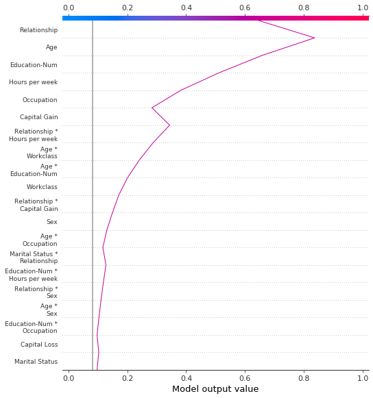
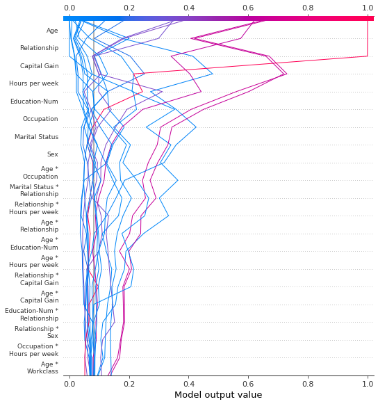
决策图支持 SHAP 交互值:从基于树的模型估计的一阶交互作用。虽然 SHAP 依赖图是可视化单个交互作用的最佳方式,但决策图可以显示一个或多个观察的主要效果和交互作用的累积效应。
此处的决策图使用主要效果和交互作用解释了来自 UCI Adult Income 数据集的单个预测。显示了 20 个最重要的特征。有关支持交互作用的更多详细信息,请参阅“SHAP 交互值”部分。
[14]:
shap.decision_plot(
    expected_value,
    shap_interaction_values[misclassified],
    features_display[misclassified],
    link="logit",
)
探索一系列特征值的特征效果
决策图可以揭示预测如何在一组特征值范围内变化。此方法对于呈现假设情景和揭示模型行为很有用。在本示例中,我们创建了仅在资本收益方面不同的假设观察结果。
从 UCI Adult Income 数据集中的以下参考观察结果开始。
[15]:
idx = 25
X_display.loc[idx]
[15]:
Age                                56
Workclass                   Local-gov
Education-Num                      13
Marital Status     Married-civ-spouse
Occupation               Tech-support
Relationship                  Husband
Race                            White
Sex                              Male
Capital Gain                        0
Capital Loss                        0
Hours per week                     40
Country                 United-States
Name: 25, dtype: object
使用参考观察结果的多个副本创建合成数据集。将“Capital Gain”的值从 0 美元到 10,000 美元以 100 美元为单位进行变化。检索相应的 SHAP 值。此方法允许我们评估和调试模型。分析师也可能发现此方法对于呈现假设情景很有用。请记住,本示例中显示的资本收益效果特定于参考记录,因此无法推广。
[16]:
rg = range(0, 10100, 100)
R = X.iloc[np.repeat(idx, len(rg))].reset_index(drop=True)
R["Capital Gain"] = rg

with warnings.catch_warnings():
    warnings.simplefilter("ignore")
    hypothetical_shap_values = explainer.shap_values(R)[1]

hypothetical_predictions = expected_value + hypothetical_shap_values.sum(axis=1)
hypothetical_predictions = 1 / (1 + np.exp(-hypothetical_predictions))
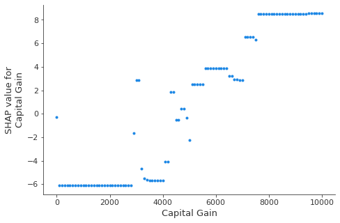
此依赖图显示了特征值范围内的 SHAP 值变化。此模型的 SHAP 值表示对数几率的变化。此图显示在 5,000 美元左右的 SHAP 值有显着变化。它还显示了 0 美元和大约 3,000 美元的一些显着异常值。
[17]:
shap.dependence_plot("Capital Gain", hypothetical_shap_values, R, interaction_index=None)
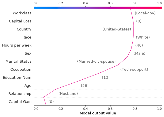
虽然依赖图很有帮助,但很难辨别上下文中 SHAP 值的实际效果。为此,我们可以在概率尺度上使用决策图绘制合成数据集。首先,我们绘制参考观察结果以建立上下文。预测概率为 0.76。资本收益为零,模型为此分配了一个小的负面影响。特征已手动排序以匹配接下来的两个图。
[18]:
# The feature ordering was determined via 'hclust' on the synthetic data set. We specify the order here manually so
# the following two plots match up.
feature_idx = [8, 5, 0, 2, 4, 3, 7, 10, 6, 11, 9, 1]
shap.decision_plot(
    expected_value,
    hypothetical_shap_values[0],
    X_display.iloc[idx],
    feature_order=feature_idx,
    link="logit",
)
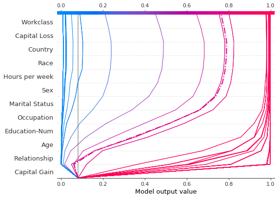
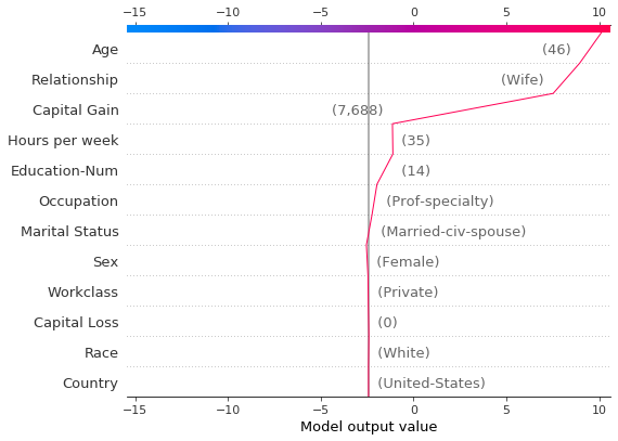
现在,我们绘制合成数据。参考记录用虚线标记。特征通过分层聚类排序,以对相似的预测路径进行分组。我们看到,实际上,资本收益的效果在很大程度上是两极分化的;只有少数预测值介于 0.2 和 0.8 之间。
[19]:
shap.decision_plot(
    expected_value,
    hypothetical_shap_values,
    R,
    link="logit",
    feature_order="hclust",
    highlight=0,
)
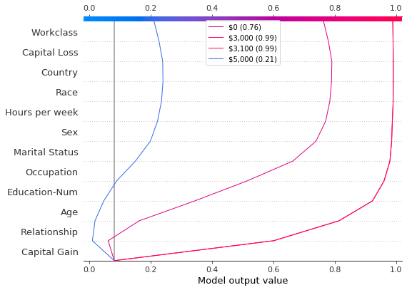
在进一步检查预测后,我们发现了一个大约 4,300 美元的阈值,但存在异常。0 美元、3,000 美元和 3,100 美元的资本收益导致意外的高预测值;5,000 美元的资本收益导致意外的低预测值。这些异常值在此处绘制,并带有图例,以帮助识别每个预测。3,000 美元和 3,100 美元的预测路径相同。
[20]:
def legend_labels(idx):
    return [rf"\${i * 100:,} ({hypothetical_predictions[i]:.2f})" for i in idx]


show_idx = [0, 30, 31, 50]
shap.decision_plot(
    expected_value,
    hypothetical_shap_values[show_idx],
    X,
    feature_order=feature_idx,
    link="logit",
    legend_labels=legend_labels(show_idx),
    legend_location="upper center",
)
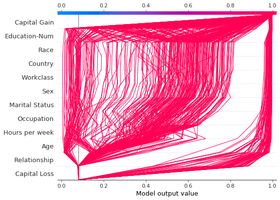
识别异常值
决策图可以帮助识别异常值。指定 feature_order='hclust' 以将具有相似预测路径的观察结果分组。这通常使异常值更容易被发现。绘制异常值时,避免使用 link='logit',因为预测幅度会被 sigmoid 函数扭曲。
下图显示了概率范围 [0.03, 0.1] 中的所有预测。(本示例中排除了小于 0.03 的预测,因为它们代表大量观察结果。)两个预测立即脱颖而出。“Age”、“Capital Loss”和“Capital Gain”的效果最为突出。
[21]:
y_pred = model.predict(X_test)  # Get predictions on the probability scale.
T = X_test[(y_pred >= 0.03) & (y_pred <= 0.1)]
with warnings.catch_warnings():
    warnings.simplefilter("ignore")
    sh = explainer.shap_values(T)[1]
r = shap.decision_plot(expected_value, sh, T, feature_order="hclust", return_objects=True)
根据异常值的 SHAP 值定位异常值,并使用其特征值绘制它们。异常值使用与原始图相同的特征顺序和比例绘制。有关更多详细信息,请参阅“在图之间保持顺序和比例”。
[22]:
# Find the two observations with the most negative 'Age' SHAP values.
idx = np.argpartition(sh[:, T.columns.get_loc("Age")], 2)[0:2]

# Plot the observations individually with their corresponding feature values. The plots use the same feature order
# as the original plot.
for i in idx:
    shap.decision_plot(
        expected_value,
        sh[i],
        X_display.loc[T.index[i]],
        feature_order=r.feature_idx,
        xlim=r.xlim,
    )
识别典型的预测路径
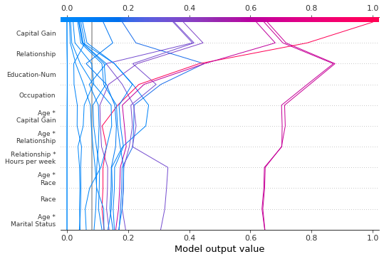
决策图可以揭示模型的典型预测路径。在这里,我们绘制概率区间 [0.98, 1.0] 中的所有预测,以查看高分预测的共同点。我们使用 'hclust' 特征排序来对相似的预测路径进行分组。该图显示了两个不同的路径:一个由“Capital Gain”主导,而另一个由“Capital Loss”主导。“Relationship”、“Age”和“Education-Num”的效果也很显着。
[23]:
y_pred = model.predict(X_test)  # Get predictions on the probability scale.
T = X_test[y_pred >= 0.98]
with warnings.catch_warnings():
    warnings.simplefilter("ignore")
    sh = explainer.shap_values(T)[1]
shap.decision_plot(expected_value, sh, T, feature_order="hclust", link="logit")
比较和对比几个模型的预测
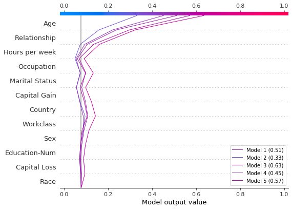
决策图对于比较来自不同模型的预测或解释模型集合的预测很有用。在本示例中,我们绘制了在 UCI Adult Income 数据集上训练的五个 LightGBM 模型集合的预测。在本示例中,我们创建了五个模型的集合,并使用 shap.multioutput_decision_plot 绘制了模型的预测。
使用 5 折交叉验证训练五个 LightGBM 模型的集合。
[26]:
model_count = 5
skf = StratifiedKFold(model_count, True, random_state=random_state)
models = []
for t, v in skf.split(X, y):
    m = lgb.LGBMClassifier(**params, n_estimators=1000)
    m.fit(
        X.iloc[t],
        y[t],
        eval_set=(X.iloc[v], y[v]),
        early_stopping_rounds=50,
        verbose=False,
    )
    score = m.best_score_["valid_0"]["binary_logloss"]
    print(f"Best score: {score}")
    models.append(m)
Best score: 0.28279460948508833
Best score: 0.2743920496745268
Best score: 0.2706647518976772
Best score: 0.2809048231217079
Best score: 0.2785044277595166
将模型的基本值和 SHAP 值组装成列表。这模仿了 shap 包对多输出模型的输出。
[27]:
def get_ensemble_shap_values(models, X):
    base_values = [None] * model_count
    shap_values = [None] * model_count
    predictions = [None] * model_count
    for i, m in enumerate(models):
        a = m.predict(X, pred_contrib=True)  # `pred_contrib=True` returns SHAP values for LightGBM
        base_values[i] = a[0, -1]  # The last column in the matrix is the base value.
        shap_values[i] = a[:, 0:-1]
        predictions[i] = 1 / (1 + np.exp(-a.sum(axis=1)[0]))  # Predictions as probabilities
    return base_values, shap_values, predictions
从集合中检索单个观察的 SHAP 值。
[28]:
(
    ensemble_base_values,
    ensemble_shap_values,
    ensemble_predictions,
) = get_ensemble_shap_values(models, X.iloc[[27]])
绘制 SHAP 值。图例标识每个模型的预测。提示:在图例标签中包含预测值,以帮助区分模型。
如果概率 0.5 是此二元分类任务的截止值,我们看到此观察结果很难分类。但是,模型 2 确信该个人的年收入低于 5 万美元。如果这是一个示例性观察结果,则可能值得检查为什么此模型的预测不同。
[29]:
# Create labels for legend
labels = [f"Model {i + 1} ({ensemble_predictions[i].round(2):.2f})" for i in range(model_count)]

# Plot
shap.multioutput_decision_plot(
    ensemble_base_values,
    ensemble_shap_values,
    0,
    feature_names=X.columns.to_list(),
    link="logit",
    legend_labels=labels,
    legend_location="lower right",
)
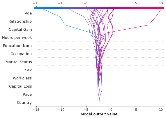
SHAP 交互值
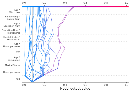
决策图支持 SHAP 交互值,如此处所示。请注意,线不会在图的底部完全收敛到 explainer.expected_value。这是因为包括交互作用和主要效果在内,有 N(N + 1)/2 = 12(13)/2 = 78 个特征,但默认情况下,决策图仅显示 20 个最重要的特征。请参阅“选择要显示的特征”部分,了解如何显示更多特征。
[30]:
shap.decision_plot(expected_value, shap_interaction_values, features, link="logit")
决策图将三维 SHAP 交互结构转换为标准的二维 SHAP 矩阵。它还会生成相应的特征标签。可以通过设置 return_objects=True 从决策图中检索这些结构。在本示例中,我们通过设置 show=False 省略了该图。
[31]:
r = shap.decision_plot(
    expected_value,
    shap_interaction_values,
    features,
    link="logit",
    show=False,
    return_objects=True,
)
plt.close()
print(f"SHAP dimensions: {r.shap_values.shape}", "\n")
pprint(r.feature_names[:-11:-1])
SHAP dimensions: (20, 78)

['Age',
 'Relationship',
 'Capital Gain',
 'Hours per week',
 'Education-Num',
 'Occupation',
 'Marital Status',
 'Sex',
 'Age *\nOccupation',
 'Marital Status *\nRelationship']
在图之间保持顺序和比例
通常,创建多个使用相同特征顺序和 x 轴比例的决策图以方便直接比较很有帮助。当 return_objects=True 时,决策图返回可在后续图中使用的绘图结构。
[32]:
# Create the first plot, returning the plot structures.
r = shap.decision_plot(expected_value, shap_values, features_display, return_objects=True)
[33]:
# Create another plot using the same feature order and x-axis extents.
idx = 9
shap.decision_plot(
    expected_value,
    shap_values[idx],
    features_display.iloc[idx],
    feature_order=r.feature_idx,
    xlim=r.xlim,
)
选择要显示的特征
决策图中显示的特征由两个参数控制:feature_order 和 feature_display_range。feature_order 参数确定特征在显示之前的排序方式。feature_display_range 参数确定显示哪些已排序的特征。它接受 slice 或 range 对象作为参数。feature_display_range 参数还控制特征是按升序还是降序绘制。
例如,如果 feature_order='importance'(默认值),则决策图在显示之前按重要性升序排列特征。如果 feature_display_range=slice(-1, -21, -1)(默认值),则该图以降序显示最后(即,最重要)的 20 个特征。对象 slice(-1, -21, -1) 被解释为“从最后一个特征开始,迭代到从末尾开始的第 21 个特征,步长为 -1。”端点 -21 不包括在内。
当应用 'hclust' 排序时,feature_display_range 参数尤其重要。在这种情况下,许多重要特征都位于特征范围的开头。但是,默认情况下,决策图显示特征范围的末尾。
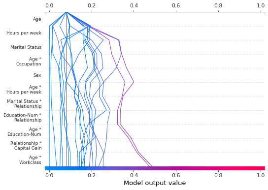
下图显示了使用 'hclust' 排序的 78 个 SHAP 交互特征中的前 10 个。注意:因为我们仅显示前 10 个特征,所以观察结果不会在其最终预测值处击中 x 轴。 代码段 feature_display_range=range(10, -1, -1) 指示我们从特征 10 开始计数到特征 -1,步长为 -1。端点不包含在范围内。因此,我们看到了特征 10 到 0。
[34]:
shap.decision_plot(
    expected_value,
    shap_interaction_values,
    features,
    link="logit",
    feature_order="hclust",
    feature_display_range=range(10, -1, -1),
)
我们可以通过指定升序范围来按升序生成相同的图:range(0, 11, 1)。
[35]:
shap.decision_plot(
    expected_value,
    shap_interaction_values,
    features,
    link="logit",
    feature_order="hclust",
    feature_display_range=range(0, 11, 1),
)
当选择范围中的最后一个特征时,使用切片更方便,因为切片支持负索引。例如,索引 -20 表示从末尾开始的第 20 个项目。下图显示了降序 'hclust' 顺序的最后 10 个特征。
[36]:
shap.decision_plot(
    expected_value,
    shap_interaction_values,
    features,
    link="logit",
    feature_order="hclust",
    feature_display_range=slice(None, -11, -1),
)
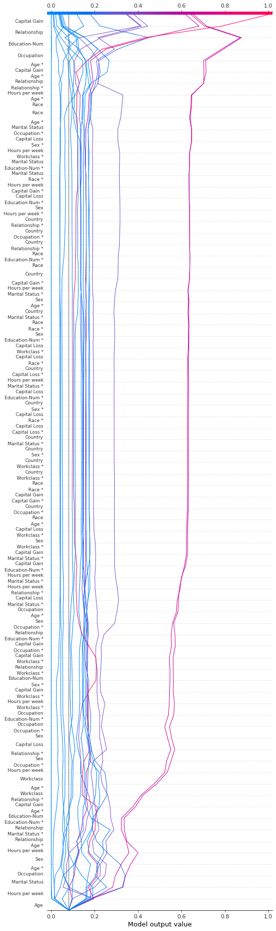
我们可以通过多种方式显示所有可用特征。最简单的是 feature_display_range=slice(None, None, -1)。注意:如果您的数据集包含许多特征,这将生成一个非常大的图。
[37]:
shap.decision_plot(
    expected_value,
    shap_interaction_values,
    features,
    link="logit",
    feature_order="hclust",
    feature_display_range=slice(None, None, -1),
)
更改 SHAP 基值
SHAP 值都相对于某个基值。默认情况下,基值是 explainer.expected_value:训练数据的原始模型预测的平均值。
[38]:
# The model's training mean
print(model.predict(X_train, raw_score=True).mean().round(4))

# The explainer expected value
print(expected_value.round(4))
-2.4297
-2.4297
为了获得原始预测值,explainer.expected_value 被添加到每个观察的 SHAP 值之和中。
[39]:
# The model's raw prediction for the first observation.
print(model.predict(features.iloc[[0]].values, raw_score=True)[0].round(4))

# The corresponding sum of the mean + shap values
print((expected_value + shap_values[0].sum()).round(4))
-3.1866
-3.1866
因此,必须将 explainer.expected_value 提供给决策图以产生正确的预测。
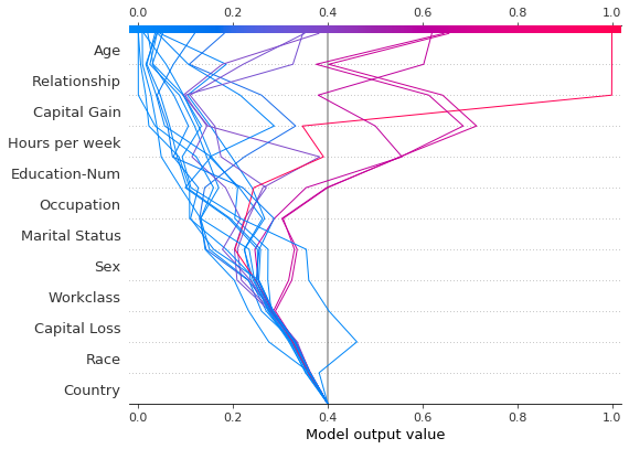
在决策图中,基值是每个预测在图底部开始的值。使用 explainer.expected_value 作为基值并非总是直观的。考虑一个逻辑分类问题。如果我们选择概率 0.4 作为截止值,如果预测值在截止点而不是 explainer.expected_value 处收敛,则可能更有意义。为此,决策图提供了 new_base_value 参数。它将 SHAP 基值移动到任意点,而不会改变预测值。
在本示例中,我们将概率 0.4 指定为新的基值。由于我们模型的 SHAP 值是对数几率,因此我们在将其传递给决策图之前将概率转换为对数几率。link='logit' 参数将基值和 SHAP 值转换为概率。
[40]:
p = 0.4  # Probability 0.4
new_base_value = np.log(p / (1 - p))  # the logit function
shap.decision_plot(
    expected_value,
    shap_values,
    features_display,
    link="logit",
    new_base_value=new_base_value,
)
为了比较,这是具有原始基值的决策图。
[41]:
shap.decision_plot(expected_value, shap_values, features_display, link="logit")
