scatter 散点图
本笔记本旨在演示(并因此记录)如何使用 shap.plots.scatter 函数。它使用在经典的 UCI 成人收入数据集上训练的 XGBoost 模型(这是一个分类任务,用于预测 90 年代人们的收入是否超过 5 万美元)。
[1]:
import xgboost

import shap

# train XGBoost model
X, y = shap.datasets.adult()
model = xgboost.XGBClassifier().fit(X, y)

# compute SHAP values
explainer = shap.Explainer(model, X)
explanation = explainer(X[:1000])
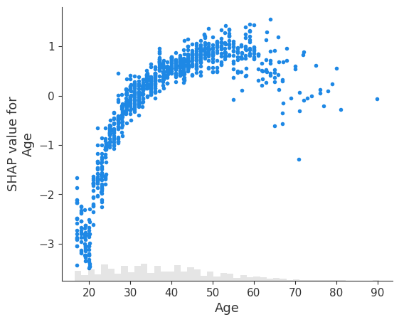
简单依赖散点图
依赖散点图显示了单个特征对模型预测的影响。在此示例中,收入超过 5 万美元的概率在 20 岁到 40 岁之间显着增加。
每个点都是来自数据集的单个预测(行)。
x 轴是特征的值(来自 X 矩阵,存储在
explanation.data中)。y 轴是该特征的 SHAP 值(存储在
explanation.values中),它表示了解该特征的值在多大程度上改变了模型对该样本预测的输出。对于此模型,单位是年收入超过 5 万美元的对数几率。绘图底部的浅灰色区域是显示数据值分布的直方图。
[2]:
# Note that we are slicing off the column of the shap_values Explanation corresponding to the "Age" feature
shap.plots.scatter(explanation[:, "Age"])
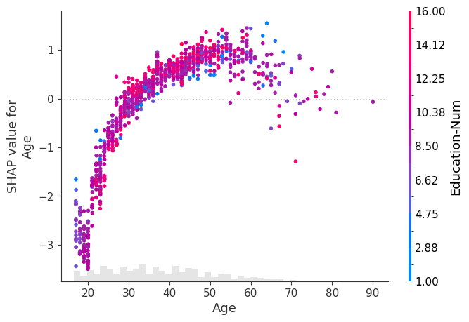
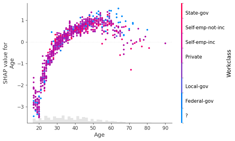
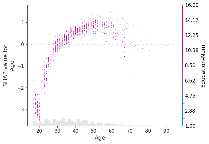
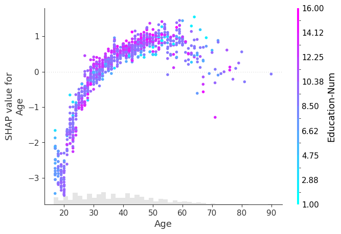
使用颜色突出交互效应
上面绘图中的垂直分散表明,对于不同的人,Age 特征的相同值可能对模型的输出产生不同的影响。这意味着模型中 Age 和其他特征之间存在非线性交互效应(否则,散点图将完美地遵循 shap.plots.partial_dependence 给出的线)。
为了显示哪个特征可能正在驱动这些交互效应,我们可以使用另一个特征为我们的 Age 依赖散点图着色。如果我们将整个 Explanation 对象传递给 color 参数,则散点图会尝试挑选出与 Age 交互作用最强的特征列。如果此其他特征与我们正在绘制的特征之间存在交互效应,则它将显示为独特的垂直着色模式。对于下面的示例,与教育程度较低的 20 岁年轻人相比,教育程度较高的 20 岁年轻人收入超过 5 万美元的可能性更低。这表明 Education-Num 和 Age 之间存在交互效应。
[3]:
shap.plots.scatter(explanation[:, "Age"], color=explanation)
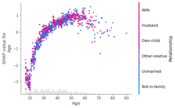
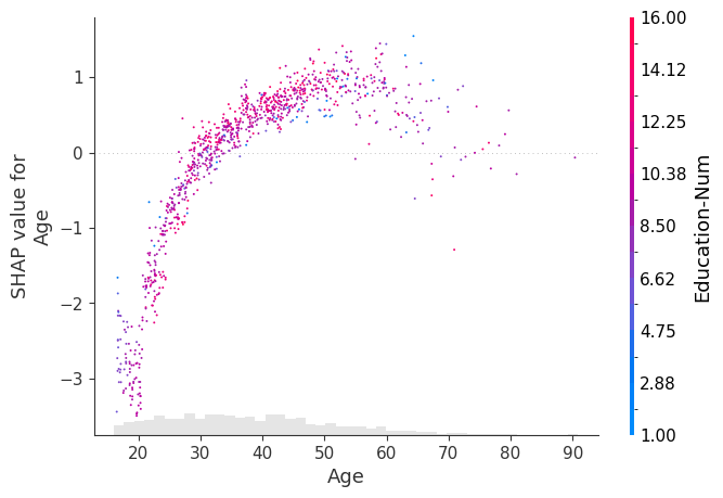
要显式控制用于着色的特征,您可以将特定的特征列传递给 color 参数。
[4]:
shap.plots.scatter(explanation[:, "Age"], color=explanation[:, "Workclass"])
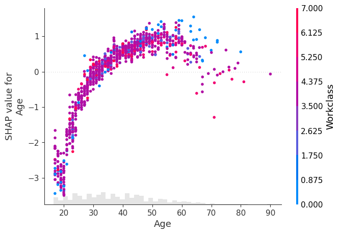
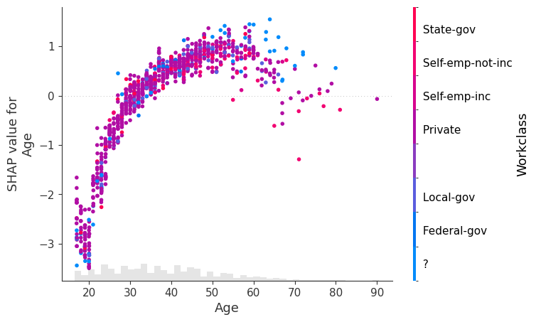
在上面的绘图中,我们看到 Workclass 特征为了 XGBoost 模型而被编码为一个数字。但是,在绘图时,我们通常更愿意使用分类编码之前的原始字符串值。为此,我们可以将 Explanation 对象的 .display_data 属性设置为我们希望在绘图中显示的并行版本的数据。
[5]:
X_display, y = shap.datasets.adult(display=True)
explanation.display_data = X_display.values

shap.plots.scatter(explanation[:, "Age"], color=explanation[:, "Workclass"])
使用全局特征重要性排序
有时我们不知道要绘制的特征的名称或索引,我们只想绘制最重要的特征。为此,我们可以使用 Explanation 对象的点链式功能来计算全局特征重要性的度量,按该度量(降序)排序,然后挑选出最重要的特征(在本例中为 Age)。
[6]:
shap.plots.scatter(explanation[:, explanation.abs.mean(0).argsort[-1]])

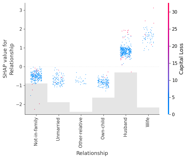
以及第二重要的特征,即 Relationship
[7]:
shap.plots.scatter(explanation[:, explanation.abs.mean(0).argsort[-2]])
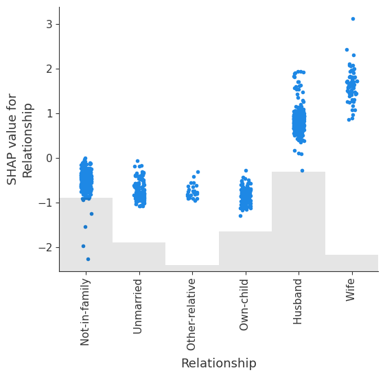
我们可以显式观察 Relationship 中不同类别的 shap 值的分布。
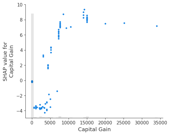
请注意,我们选择如何衡量特征的全局重要性将影响我们获得的排名。在此示例中,Age 是整个数据集中平均绝对值最大的特征,但 Capital gain 是任何样本绝对影响最大的特征。
[8]:
shap.plots.scatter(explanation[:, explanation.abs.max(0).argsort[-1]])

max 函数可能对外liers敏感。一个更稳健的选择是使用百分位数函数。在这里,我们按特征的第 95 个百分位数绝对值对特征进行排序,发现 Capital gain 具有最大的第 95 个百分位数的值
[9]:
shap.plots.scatter(explanation[:, explanation.abs.percentile(95, 0).argsort[-1]])
探索不同的交互着色
[10]:
# we can use shap.approximate_interactions to guess which features
# may interact with age
inds = shap.utils.potential_interactions(explanation[:, "Age"], explanation)

# make plots colored by each of the top three possible interacting features
for i in range(3):
    shap.plots.scatter(explanation[:, "Age"], color=explanation[:, inds[i]])

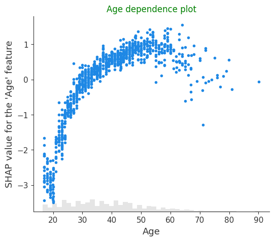
自定义图形属性
更改标题和刻度标签
[11]:
# by passing show=False you can prevent shap.dependence_plot from calling
# the matplotlib show() function, and so you can keep customizing the plot
# before eventually calling show yourself
import matplotlib.pyplot as plt

scatter = shap.plots.scatter(explanation[:, "Age"], show=False)
plt.title("Age dependence plot", color="g")
plt.ylabel("SHAP value for the 'Age' feature")

# plt.savefig("my_dependence_plot.pdf") # we can save a PDF of the figure if we want
plt.show()
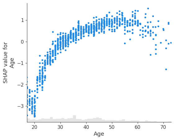
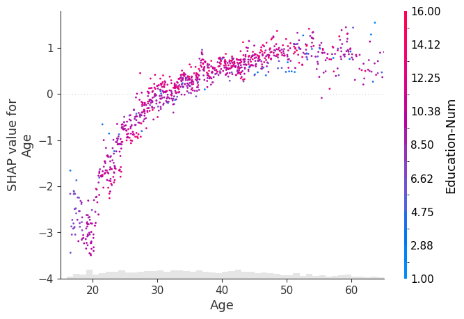
控制异常值
[12]:
# you can use xmax and xmin with a percentile notation to hide outliers.
# note that the .percentile method applies to both the .values and .data properties
# of the Explanation object, and the scatter plots knows to use the .data propoerty
# when passed to the xmin or xmax arguments.
age = explanation[:, "Age"]
shap.plots.scatter(age, xmin=age.percentile(1), xmax=age.percentile(99))
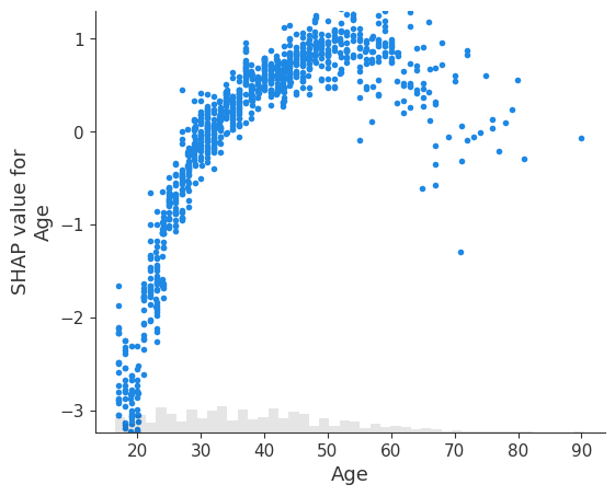
[13]:
# you can use ymax and ymin with a percentile notation to hide vertical outliers.
# note that now the scatter plot uses the .value property for ymin and ymax if
# an explanation object is passed in those parameters.
age = explanation[:, "Age"]
shap.plots.scatter(age, ymin=age.percentile(1), ymax=age.percentile(99))
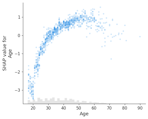
点的透明度
[14]:
# transparency can help reveal dense vs. sparse areas of the scatter plot
shap.plots.scatter(explanation[:, "Age"], alpha=0.2)
更改点大小
[15]:
# transparency can help reveal dense vs. sparse areas of the scatter plot
shap.plots.scatter(explanation[:, "Age"], dot_size=2, color=explanation)  # default dot_size is 16
为点添加 x 轴抖动
[16]:
# for categorical (or binned) data adding a small amount of x-jitter makes
# thin columns of dots more readable
shap.plots.scatter(explanation[:, "Age"], dot_size=2, x_jitter=1, color=explanation)
[17]:
shap.plots.scatter(
    explanation[:, "Age"],
    dot_size=4,
    x_jitter=1,
    color=explanation,
    xmin=15,
    xmax=65,
    ymin=-4,
    ymax=1.8,
)
[18]:
# for categorical (or binned) data adding a small amount of x-jitter makes
# thin columns of dots more readable
shap.plots.scatter(explanation[:, "Relationship"], dot_size=2, x_jitter=0.5, color=explanation)
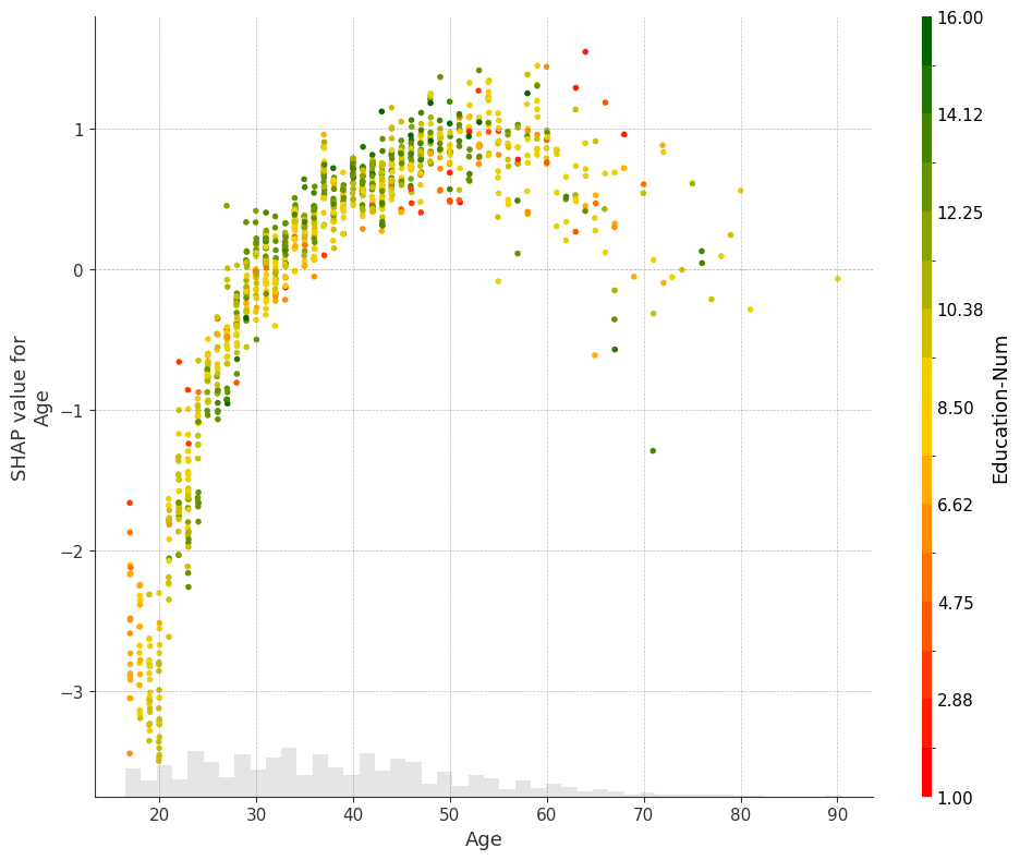
自定义颜色映射
[19]:
import matplotlib.pyplot as plt

# you can use the cmap parameter to provide your own custom color map
shap.plots.scatter(explanation[:, "Age"], color=explanation, cmap=plt.get_cmap("cool"))
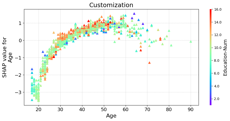
其他自定义
[20]:
fig, ax = plt.subplots(tight_layout=True, figsize=(10, 8))

from matplotlib.colors import LinearSegmentedColormap

start_color = (1, 0, 0)  # red
middle_color = (1, 0.843, 0)  # gold
end_color = (0, 0.392, 0)

cmap = LinearSegmentedColormap.from_list("custom_cmap", [start_color, middle_color, end_color], N=1000)

ax.grid(linestyle="--", color="gray", linewidth=0.5, zorder=0, alpha=0.5)

shap.plots.scatter(explanation[:, "Age"], color=explanation, cmap=cmap, ax=ax)
[21]:
fig, ax = plt.subplots(tight_layout=True, figsize=(10, 5))

# or you need more flexible customization
scatter = ax.scatter(
    explanation[:, "Age"].data,
    explanation[:, "Age"].values,
    c=explanation[:, "Education-Num"].data,
    marker="^",
    cmap=plt.get_cmap("rainbow"),
    rasterized=True,
    zorder=5,
)

cbar = plt.colorbar(scatter, aspect=50, format="%2.1f")
cbar.set_label("Education-Num", fontsize=14)
cbar.outline.set_visible(False)

ax.set_title("Customization", fontsize=18)
ax.set_xlabel("Age", fontsize=16)
ax.set_ylabel("SHAP value for\nAge", fontsize=16)

ax.tick_params(labelsize=14)

ax.grid(linestyle="--", color="gray", linewidth=0.5, zorder=0, alpha=0.5)

plt.show()
有更多有用的示例的想法吗? 欢迎提交拉取请求以添加到此文档笔记本!