NHANES I 生存模型
这是一个关于 NHANES I 数据的 Cox 比例风险模型,带有来自 NHANES I 流行病学后续研究的后续死亡率数据。它旨在说明 SHAP 值如何能够解释 XGBoost 模型,其清晰度传统上仅由线性模型提供。我们看到了数据中有趣且非线性的模式,这表明了这种方法的潜力。请记住,我们尚未检查数据是否符合当前的实验室测试标准,因此您不应将结果视为可操作的医疗见解,而应将其视为概念验证。
[1]:
import matplotlib.pylab as pl
import numpy as np
import xgboost
from sklearn.model_selection import train_test_split

import shap
创建 XGBoost 数据对象
这使用了 SHAP 数据集模块中提供的 NHANES I 数据的预处理子集。
[2]:
X, y = shap.datasets.nhanesi()

# human readable feature values
X_display, y_display = shap.datasets.nhanesi(display=True)

xgb_full = xgboost.DMatrix(X, label=y)

# create a train/test split
X_train, X_test, y_train, y_test = train_test_split(X, y, test_size=0.2, random_state=7)
xgb_train = xgboost.DMatrix(X_train, label=y_train)
xgb_test = xgboost.DMatrix(X_test, label=y_test)
训练 XGBoost 模型
[3]:
params = {"eta": 0.002, "max_depth": 3, "objective": "survival:cox", "subsample": 0.5}
model_train = xgboost.train(params, xgb_train, 10000, evals=[(xgb_test, "test")], verbose_eval=1000)
[0]     test-cox-nloglik:7.67918
[1000]  test-cox-nloglik:7.02985
[2000]  test-cox-nloglik:6.97516
[3000]  test-cox-nloglik:6.96240
[4000]  test-cox-nloglik:6.96217
[5000]  test-cox-nloglik:6.96558
[6000]  test-cox-nloglik:6.96995
[7000]  test-cox-nloglik:6.97310
[8000]  test-cox-nloglik:6.97721
[9000]  test-cox-nloglik:6.98116
[9999]  test-cox-nloglik:6.98511
[4]:
# train final model on the full data set
params = {"eta": 0.002, "max_depth": 3, "objective": "survival:cox", "subsample": 0.5}
model = xgboost.train(params, xgb_full, 5000, evals=[(xgb_full, "test")], verbose_eval=1000)
[0]     test-cox-nloglik:9.28404
[1000]  test-cox-nloglik:8.60868
[2000]  test-cox-nloglik:8.53134
[3000]  test-cox-nloglik:8.49490
[4000]  test-cox-nloglik:8.47122
[4999]  test-cox-nloglik:8.45328
检查性能
C 统计量衡量我们按生存时间对人群进行排序的能力(1.0 是完美排序)。
[5]:
def c_statistic_harrell(pred, labels):
    total = 0
    matches = 0
    for i in range(len(labels)):
        for j in range(len(labels)):
            if labels[j] > 0 and abs(labels[i]) > labels[j]:
                total += 1
                if pred[j] > pred[i]:
                    matches += 1
    return matches / total


# see how well we can order people by survival
c_statistic_harrell(model_train.predict(xgb_test), y_test)
[5]:
0.817035332310394
解释模型对整个数据集的预测
[6]:
shap_values = shap.TreeExplainer(model).shap_values(X)
SHAP 汇总图
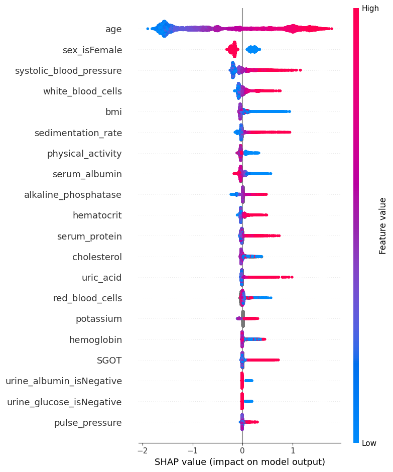
XGBoost 的 SHAP 值解释了模型的边际输出,这是 Cox 比例风险模型中死亡对数几率的变化。我们可以在下面看到,根据该模型,死亡的主要风险因素是年老。死亡风险的下一个最有力的指标是男性。
此汇总图取代了典型的特征重要性条形图。它告诉我们哪些特征最重要,以及它们在数据集上的影响范围。颜色使我们能够可视化特征值的变化如何影响风险变化(例如,高白细胞计数会导致高死亡风险)。
[7]:
shap.summary_plot(shap_values, X)
SHAP 依赖图
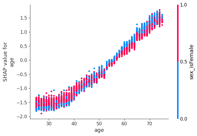
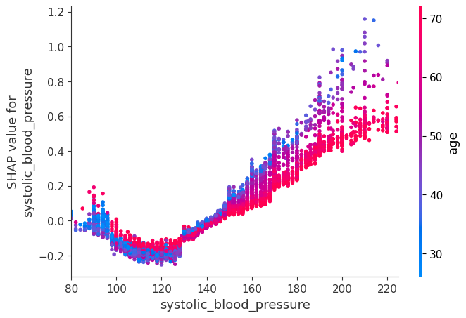
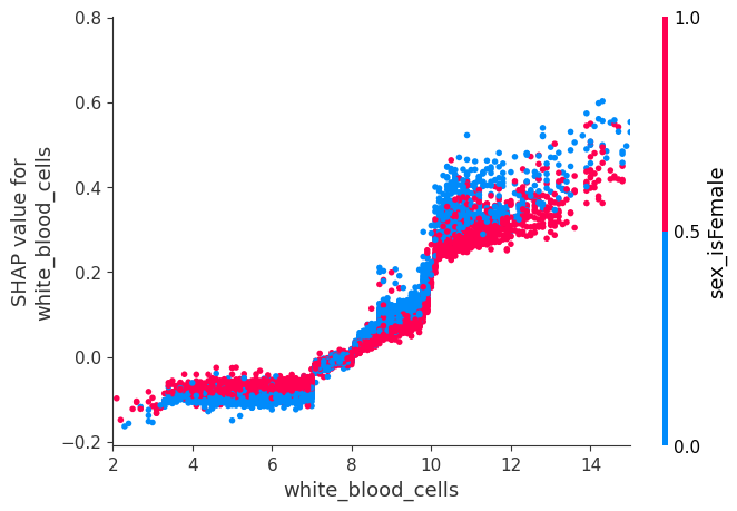
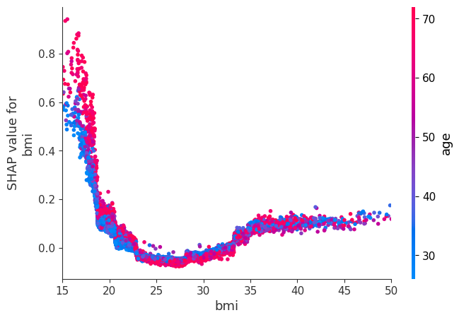
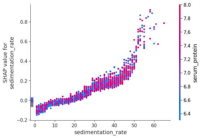
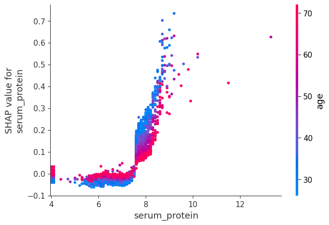
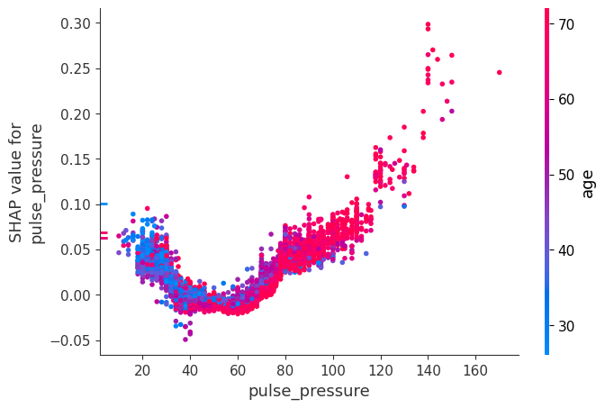
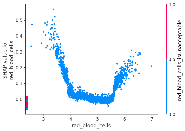
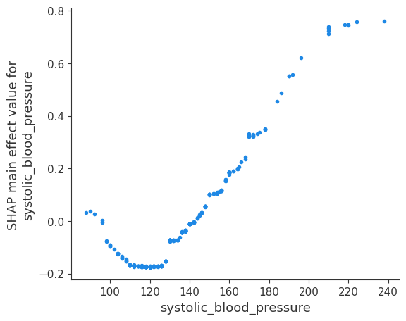
虽然 SHAP 汇总图给出了每个特征的总体概览,但 SHAP 依赖图显示了模型输出如何随特征值变化。请注意,每个点代表一个人,单个特征值的垂直离散是模型中交互作用效应的结果。用于着色的特征会自动选择,以突出显示可能驱动这些交互作用的因素。稍后我们将看到如何使用 SHAP 交互值检查交互作用是否真的在模型中。请注意,SHAP 汇总图的行是通过将 SHAP 依赖图的点投影到 y 轴上,然后按特征本身重新着色而产生的。
下面我们给出了每个 NHANES I 特征的 SHAP 依赖图,揭示了有趣但预期的趋势。请记住,其中一些值的校准可能与现代实验室测试不同,因此请谨慎得出结论。
[8]:
# we pass "age" instead of an index because dependence_plot() will find it in X's column names for us
# Systolic BP was automatically chosen for coloring based on a potential interaction to check that
# the interaction is really in the model see SHAP interaction values below
shap.dependence_plot("age", shap_values, X)
[9]:
# we pass display_features so we get text display values for sex
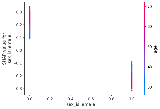
shap.dependence_plot("sex_isFemale", shap_values, X, display_features=X_display)
[10]:
# setting show=False allows us to continue customizing the matplotlib plot before displaying it
shap.dependence_plot("systolic_blood_pressure", shap_values, X, show=False)
pl.xlim(80, 225)
pl.show()
[11]:
shap.dependence_plot("white_blood_cells", shap_values, X, display_features=X_display, show=False)
pl.xlim(2, 15)
pl.show()
[12]:
shap.dependence_plot("bmi", shap_values, X, display_features=X_display, show=False)
pl.xlim(15, 50)
pl.show()
[13]:
shap.dependence_plot("sedimentation_rate", shap_values, X)
[14]:
shap.dependence_plot("serum_protein", shap_values, X)
[15]:
shap.dependence_plot("pulse_pressure", shap_values, X)
[16]:
shap.dependence_plot("red_blood_cells", shap_values, X)
计算 SHAP 交互值
有关更多详细信息,请参阅 Tree SHAP 论文,但简而言之,SHAP 交互值是 SHAP 值对更高阶交互作用的概括。在 XGBoost 的后期版本(>=1.0.0)中使用 pred_interactions 标志实现了成对交互作用的快速精确计算。使用此标志,XGBoost 为每个预测返回一个矩阵,其中主效应在对角线上,交互作用效应在非对角线上。
主效应类似于您在线性模型中获得的 SHAP 值,交互作用效应捕获所有更高阶的交互作用,并将它们分配到成对交互作用项中。请注意,整个交互作用矩阵的总和是模型当前输出与预期输出之间的差异,因此非对角线上的交互作用效应被分成两半(因为每种交互作用都有两个)。
在绘制交互作用效应时,SHAP 包会自动将非对角线值乘以 2,以获得完整的交互作用效应。
[17]:
# we only take 300 people in order to run quicker
number_patients = 300

shap_interaction_values = shap.TreeExplainer(model).shap_interaction_values(X.iloc[:number_patients, :])
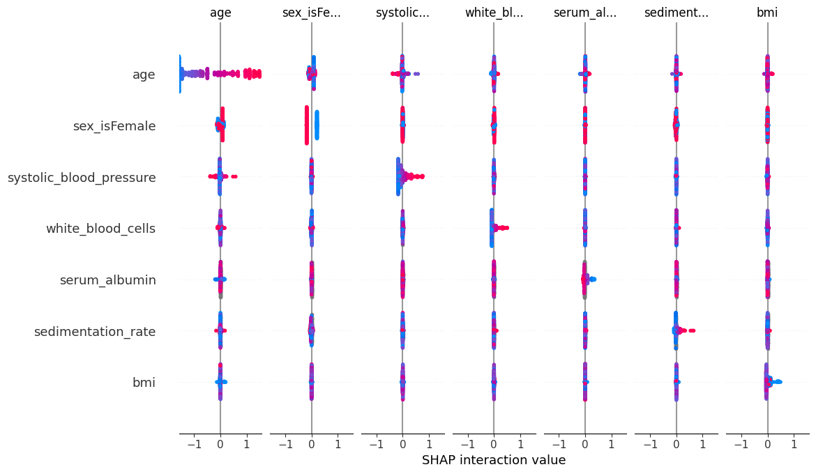
SHAP 交互值汇总图
SHAP 交互值矩阵的汇总图绘制了一个汇总图矩阵,其中主效应在对角线上,交互作用效应在非对角线上。
[18]:
shap.summary_plot(shap_interaction_values, X.iloc[:number_patients, :])
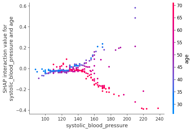
SHAP 交互值依赖图
对 SHAP 交互值运行依赖图使我们能够分别观察主效应和交互作用效应。
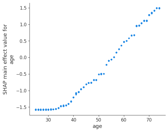
下面我们绘制了年龄的主效应以及年龄的一些交互作用效应。将年龄的主效应图与早期年龄的 SHAP 值图进行比较是有益的。主效应图没有垂直离散,因为交互作用效应都包含在非对角线项中。
[19]:
shap.dependence_plot(
    ("age", "age"),
    shap_interaction_values,
    X.iloc[:number_patients, :],
    display_features=X_display.iloc[:number_patients, :],
)
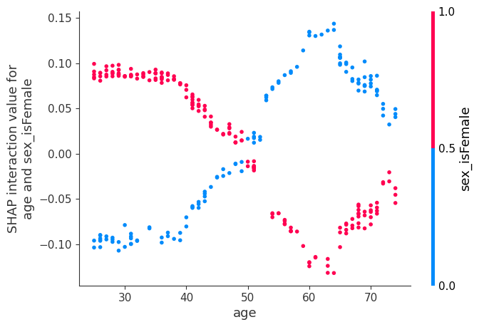
现在我们绘制涉及年龄的交互作用效应。这些效应捕获了原始 SHAP 图中存在但上述主效应图中缺失的所有垂直离散。下图涉及年龄和性别,表明基于性别的死亡风险差距随年龄变化,并在 60 岁时达到顶峰。
[20]:
shap.dependence_plot(
    ("age", "sex_isFemale"),
    shap_interaction_values,
    X.iloc[:number_patients, :],
    display_features=X_display.iloc[:number_patients, :],
)
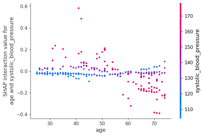
[21]:
shap.dependence_plot(
    ("age", "systolic_blood_pressure"),
    shap_interaction_values,
    X.iloc[:number_patients, :],
    display_features=X_display.iloc[:number_patients, :],
)
[22]:
shap.dependence_plot(
    ("age", "white_blood_cells"),
    shap_interaction_values,
    X.iloc[:number_patients, :],
    display_features=X_display.iloc[:number_patients, :],
)

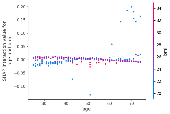
[23]:
shap.dependence_plot(
    ("age", "bmi"),
    shap_interaction_values,
    X.iloc[:number_patients, :],
    display_features=X_display.iloc[:number_patients, :],
)
现在我们展示几个收缩压的示例。
[24]:
shap.dependence_plot(
    ("systolic_blood_pressure", "systolic_blood_pressure"),
    shap_interaction_values,
    X.iloc[:number_patients, :],
    display_features=X_display.iloc[:number_patients, :],
)
[25]:
shap.dependence_plot(
    ("systolic_blood_pressure", "age"),
    shap_interaction_values,
    X.iloc[:number_patients, :],
    display_features=X_display.iloc[:number_patients, :],
)
[26]:
shap.dependence_plot(
    ("systolic_blood_pressure", "age"),
    shap_interaction_values,
    X.iloc[:number_patients, :],
    display_features=X_display.iloc[:number_patients, :],
)

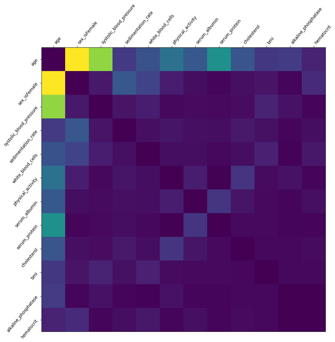
我们将所有患者的交互作用相加,以绘制哪些特征交互作用最强。请注意,我们不分析特征如何交互作用(高特征 A + 低特征 B 导致结果 C 等)。浅色显示强烈的交互作用效应
[27]:
interaction_matrix = np.abs(shap_interaction_values).sum(0)
for i in range(interaction_matrix.shape[0]):
    interaction_matrix[i, i] = 0
inds = np.argsort(-interaction_matrix.sum(0))[:12]
sorted_ia_matrix = interaction_matrix[inds, :][:, inds]
pl.figure(figsize=(12, 12))
pl.imshow(sorted_ia_matrix)
pl.yticks(
    range(sorted_ia_matrix.shape[0]),
    X.columns[inds],
    rotation=50.4,
    horizontalalignment="right",
)
pl.xticks(
    range(sorted_ia_matrix.shape[0]),
    X.columns[inds],
    rotation=50.4,
    horizontalalignment="left",
)
pl.gca().xaxis.tick_top()
pl.show()